Rendering Components
The vitepress-templ-preview plugin comes with predefined Vue components for preview rendering. Choose one and register it:
Components can be configured by passing data attributes directly to the custom templ-demo tag.
<templ-demo
  src="hello-demo"
  data-preview-first="false"
  data-go-package="true"
  data-go-imports="true"
  data-go-types="true"
  <!-- ... -->
/>
Data Attributes
The data-* attributes set options for both the rendering component and the code block.
IMPORTANT
All data-* attributes are optional and follow the data- prefix with the option name in kebab case. For example, to include the go package statement from the code block extractor, use data-go-package="true".
Code Block Extractor
Your templ code can include various elements like package declarations, import statements, constants, variables, and type definitions. Configure the code extractor to include or exclude these elements as needed.
| Option | Type | Default | Description |
|---|---|---|---|
goExportedOnly | boolean | false | Whether or not include exported functions only. |
goPackage | boolean | true | Include the package statement in the extracted code blocks. |
goImports | boolean | true | Include import statements in the extracted code blocks. |
goConsts | boolean | false | Include const declarations in the extracted code blocks. |
goVars | boolean | false | Include var declarations in the extracted code blocks. |
goTypes | boolean | false | Include type definitions in the extracted code blocks. |
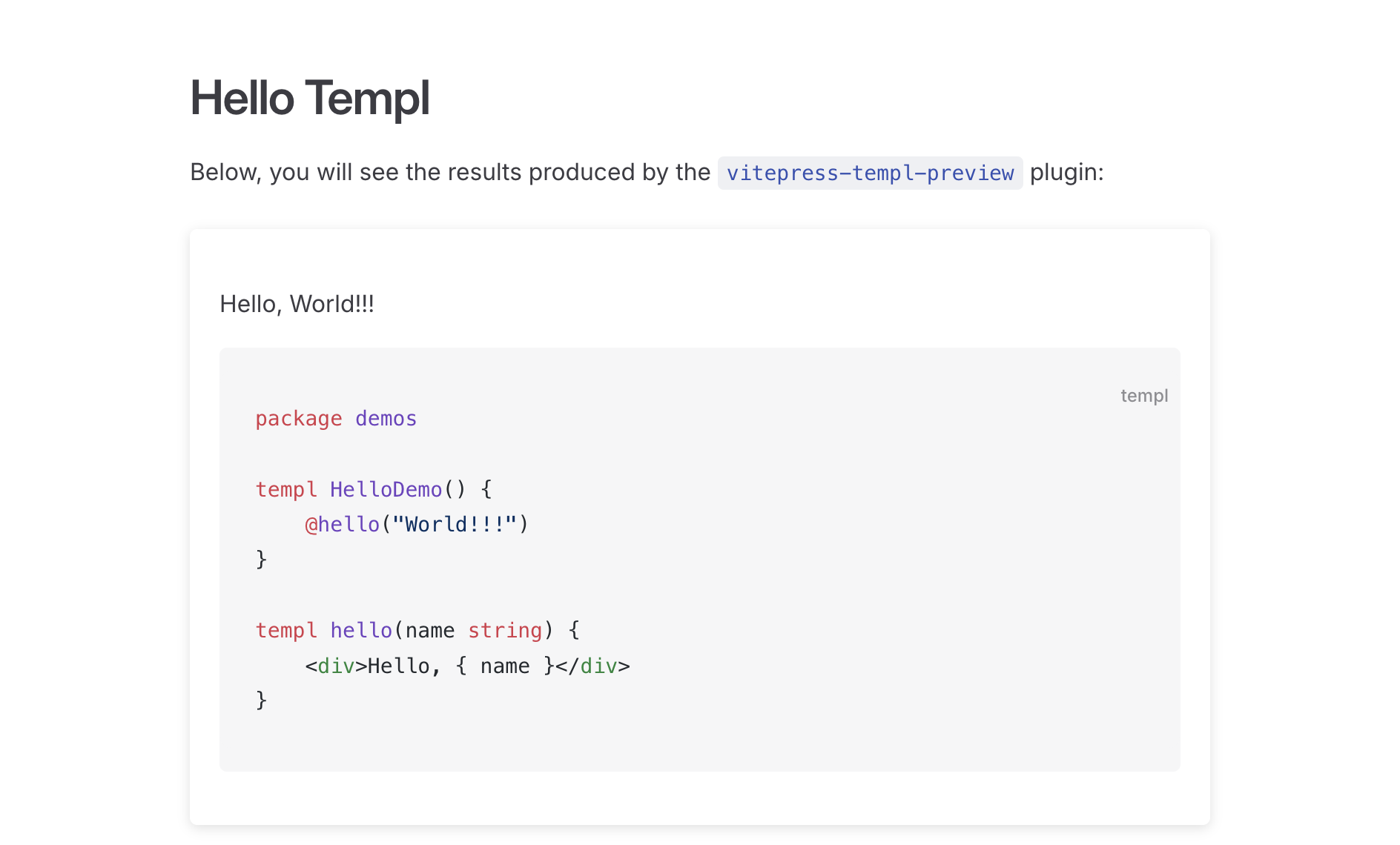
Vue Components
VTPCard
| Prop | Type | Default | Description |
|---|---|---|---|
isPreviewFirst | boolean | true | Whether or not show the preview before the code. |
Screenshot
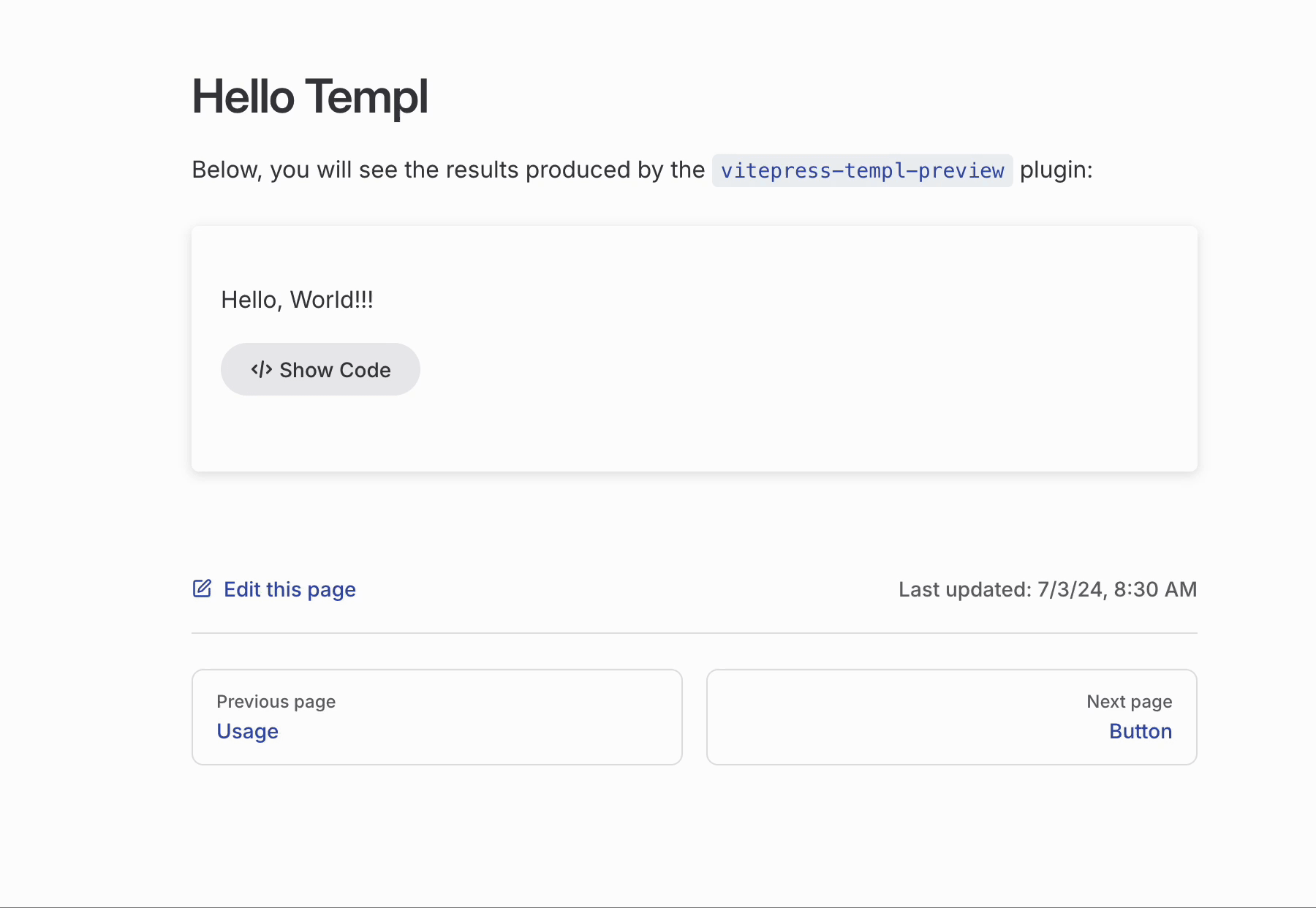
VTPCodeToggle
| Prop | Type | Default | Description |
|---|---|---|---|
buttonStyle | "alt"/"brand" | alt | Style of the show/hide code button. |
Screenshot
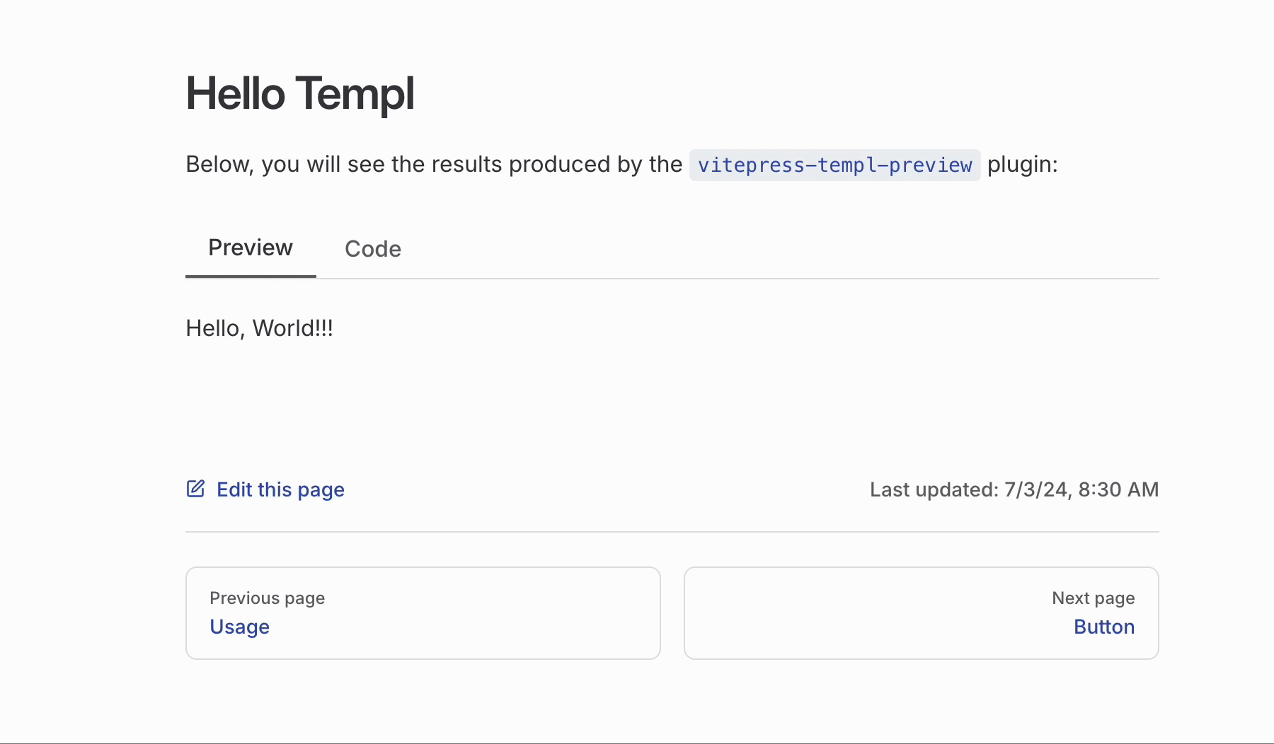
VTPTabs
Screenshot
VTPIconTabs
Screenshot
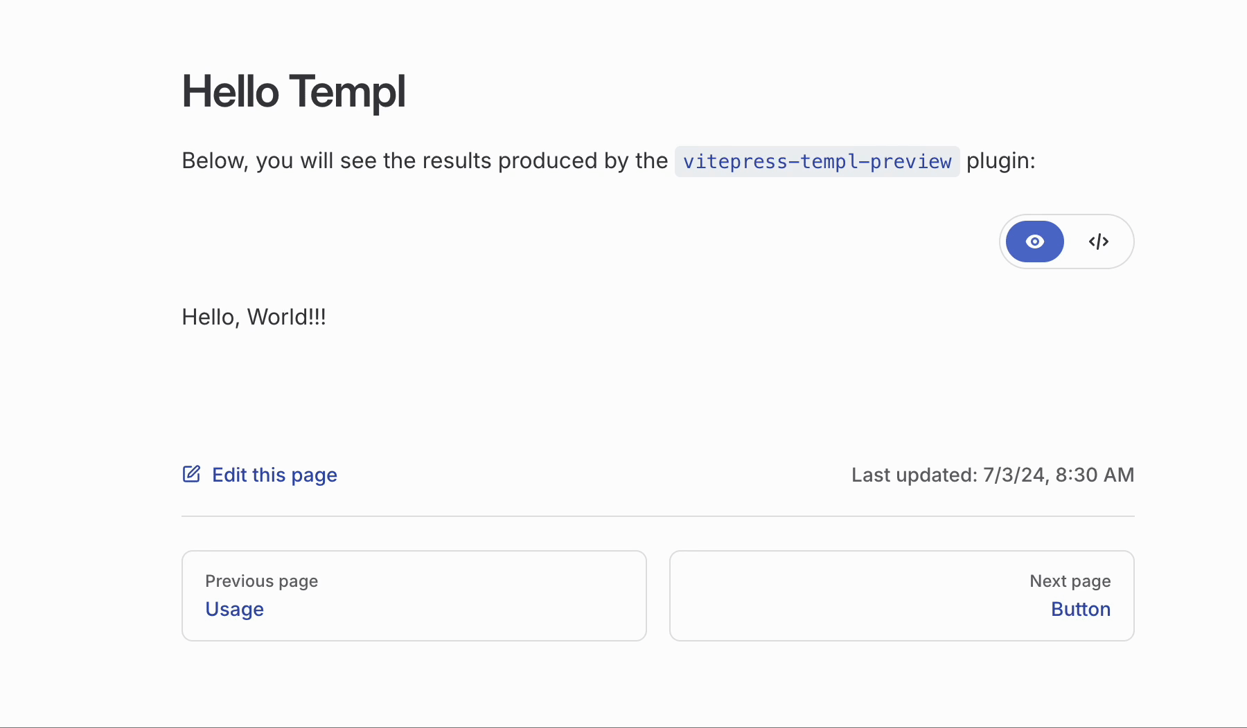
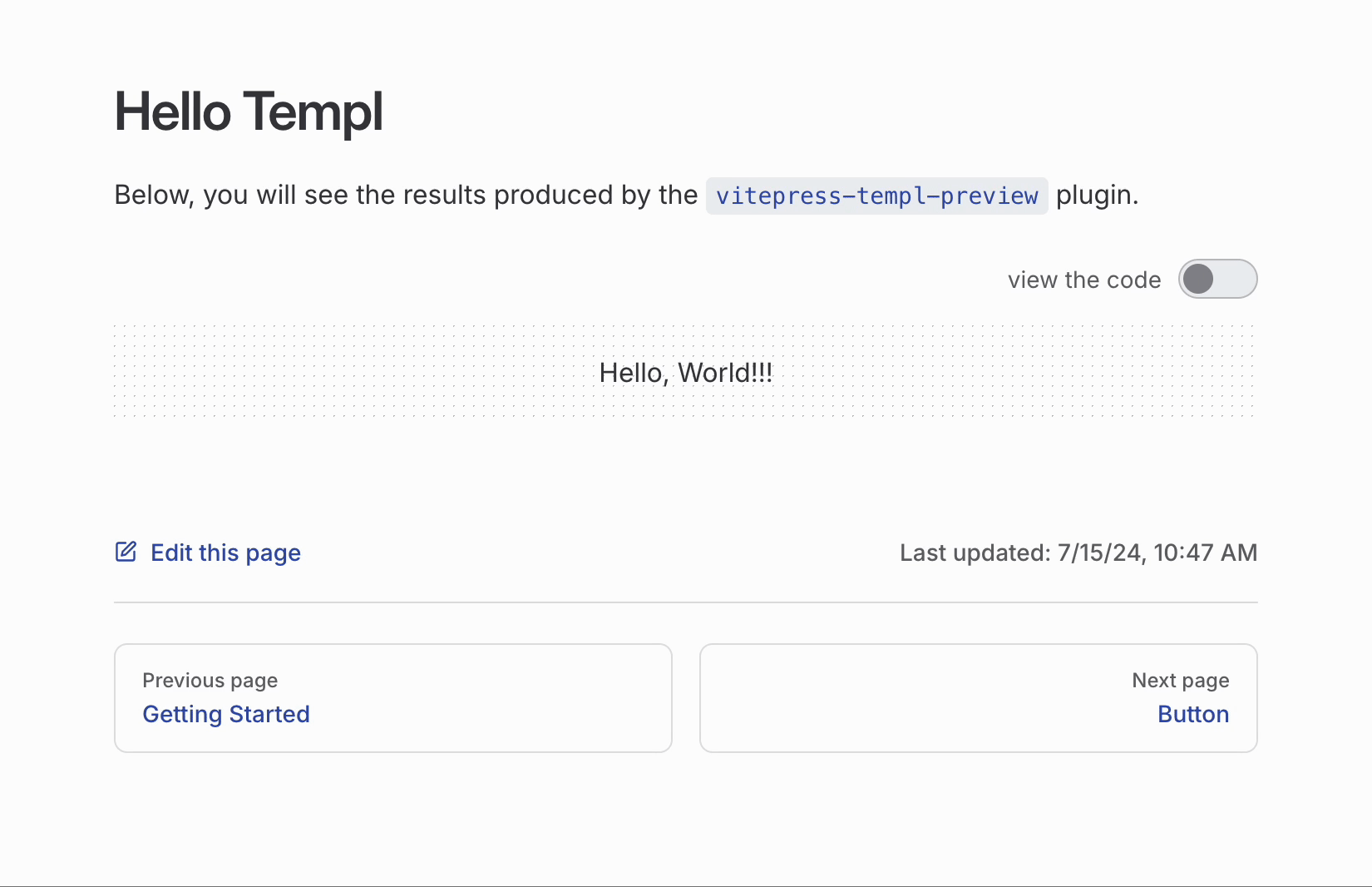
VTPToggle
| Prop | Type | Default | Description |
|---|---|---|---|
label | string | view the code | The text displayed next to the toggle button. |
activeColor | string | var(--vp-c-border) | The color of the toggle button when active. |
showLabel | boolean | true | Whether the label should be shown. |
Screenshot
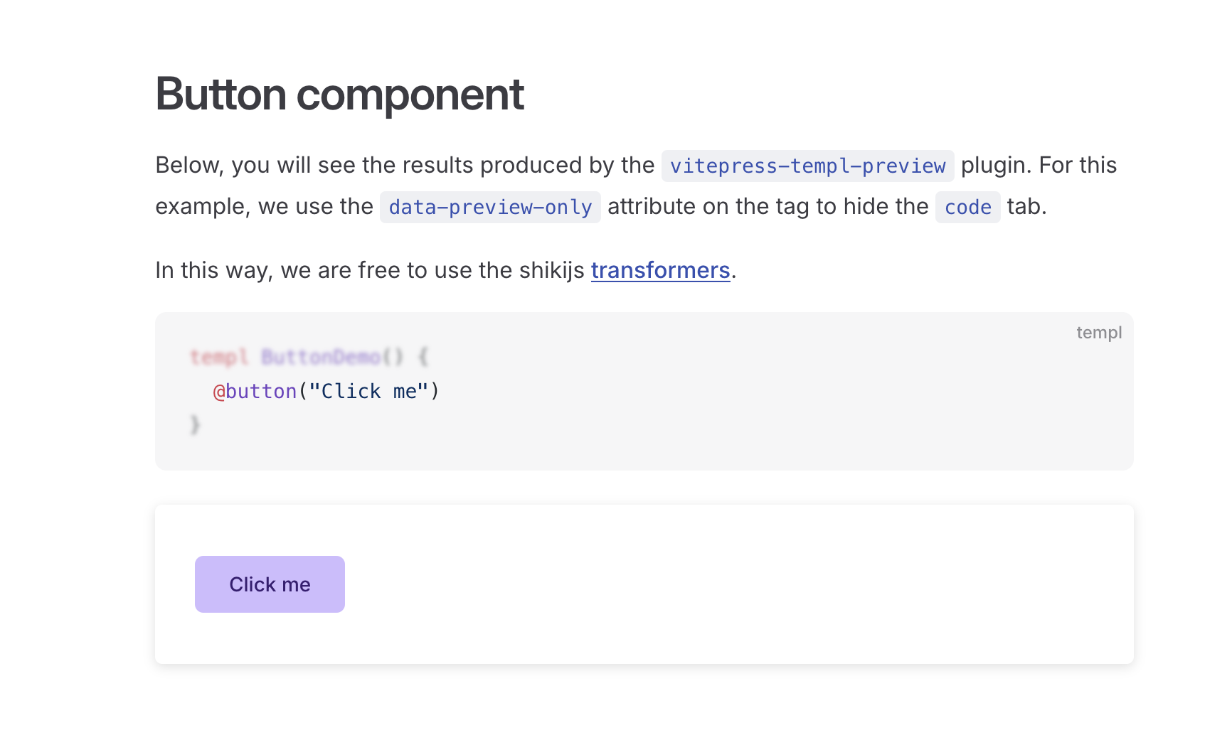
Preview-Only Mode
The vitepress-templ-preview plugin provides essential source code highlighting capabilities to ensure templ source code is displayed correctly. To maintain a lightweight profile, the plugin does not include extensive code highlighting features. If you need advanced highlighting while still previewing the component, use the data-preview-only="true" attribute. This allows you to leverage the capabilities of shikijs and vitepress, such as adding @shikijs/transformers to your project.
In some cases, you may want to preview only the templ component on specific pages. The data-preview-only attribute is applied at the tag level, giving you precise control over where the component preview is displayed. This flexibility ensures that you can manage previews on a per-page basis, optimizing the performance and appearance of your site.
Example
Use a Custom Vue Component
If you prefer to use a custom component instead of the predefined ones, it is easy to do so. Here is an example:
<script setup lang="ts">
import type { VTPComponentProps } from "vitepress-templ-plugin/types";
import { TemplScriptManager } from "vitepress-templ-preview/script-manager";
import { useHighlighter } from "vitepress-templ-preview/highlighter";
import { onMounted, nextTick } from "vue";

const props = defineProps<VTPComponentProps>();
const scriptManager = TemplScriptManager.getInstance();
const { highlightedCode, highlightCode } = useHighlighter();

onMounted(async () => {
  await highlightCode(props.codeContent, props.themes);

  nextTick(() => {
    scriptManager.executeScriptsTick();
  });
});
</script>

<template>
  <div class="preview-content" v-html="props.htmlContent"></div>
  <div class="language-templ vp-adaptive-theme">
    <button title="Copy Code" class="copy"></button>
    <span class="lang">templ</span>
    <span class="vp-code" v-html="highlightedCode"></span>
  </div>
</template>

<style scoped>
/* Your CSS here */
</style>
Remember to register it.